Bridgetown Spurs
Project Overview
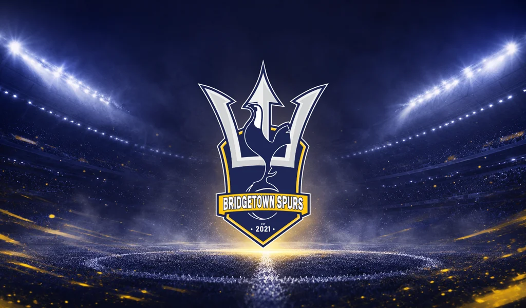
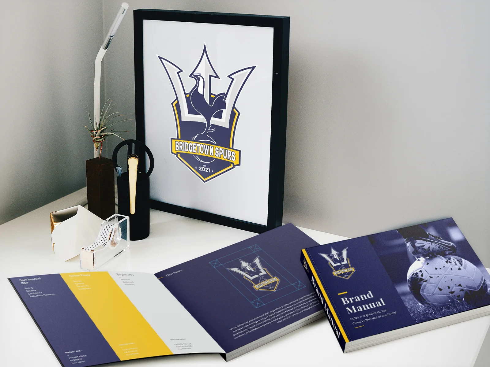
Comprehensive brand identity and visual guidelines created for Bridgetown Spurs, a football club established in 2021. The project required building a cohesive, professional look that could be applied consistently across all club communications and merchandise.
The Problem
The club needed a strong, modern visual identity that paid homage to its inspiration while standing on its own as a unique Caribbean sports brand. They also required strict brand guidelines to ensure visual consistency in typography, logo spacing, and color usage across various media.
Design Approach
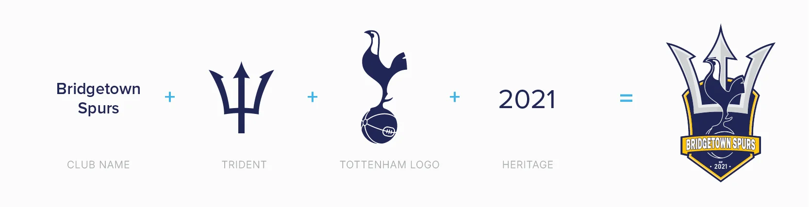
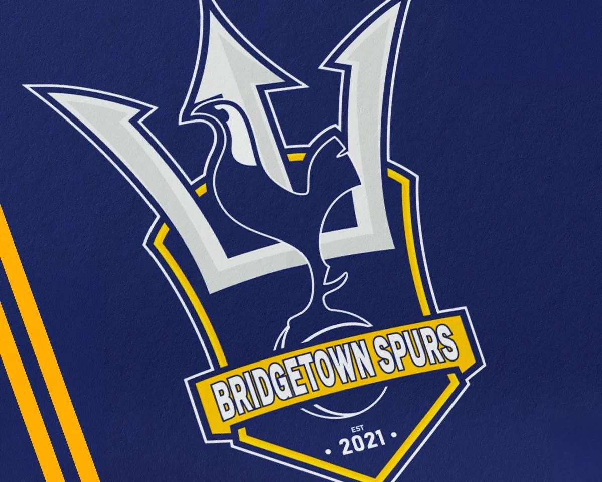
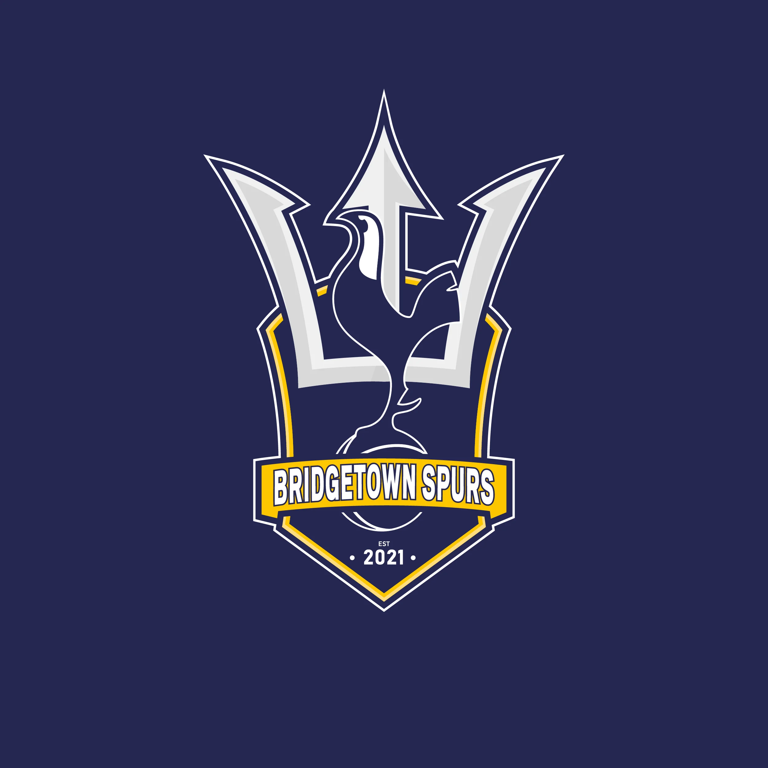
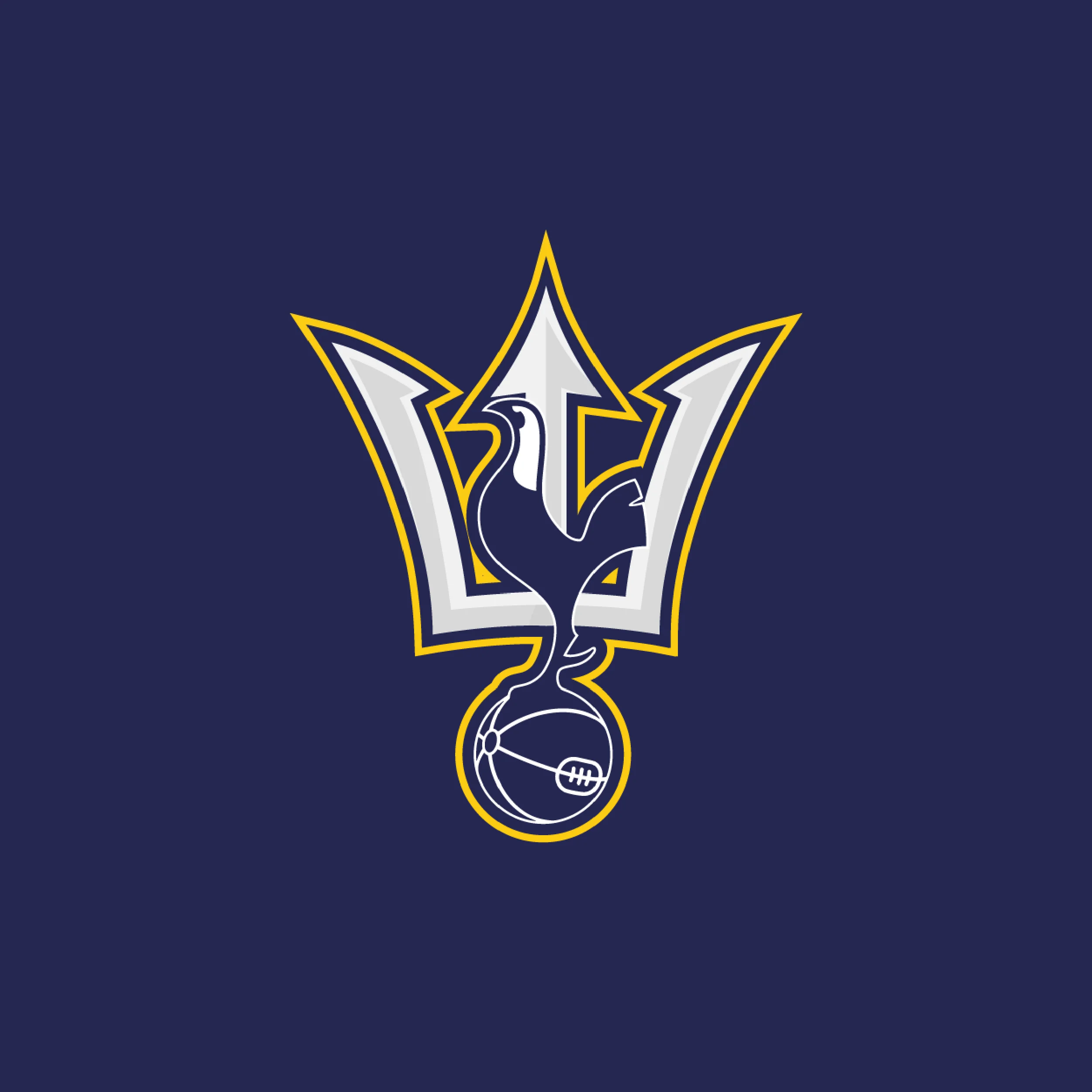
The logo was conceptualized by merging a Trident with the classic Tottenham aesthetic to honor the club's heritage. The brand system was built around a commanding 'Dark Imperial Blue' for reliability, contrasted with 'Golden Poppy' to inject Caribbean energy. Proxima Nova was selected as the primary typeface to keep all communications clean, legible, and highly professional. A complete brand manual was delivered to guide future visual applications.
Deliverables
- • Logo design and conceptualization
- • Comprehensive Brand Manual
- • Color palette and typography selection
- • Clear space and incorrect usage guidelines
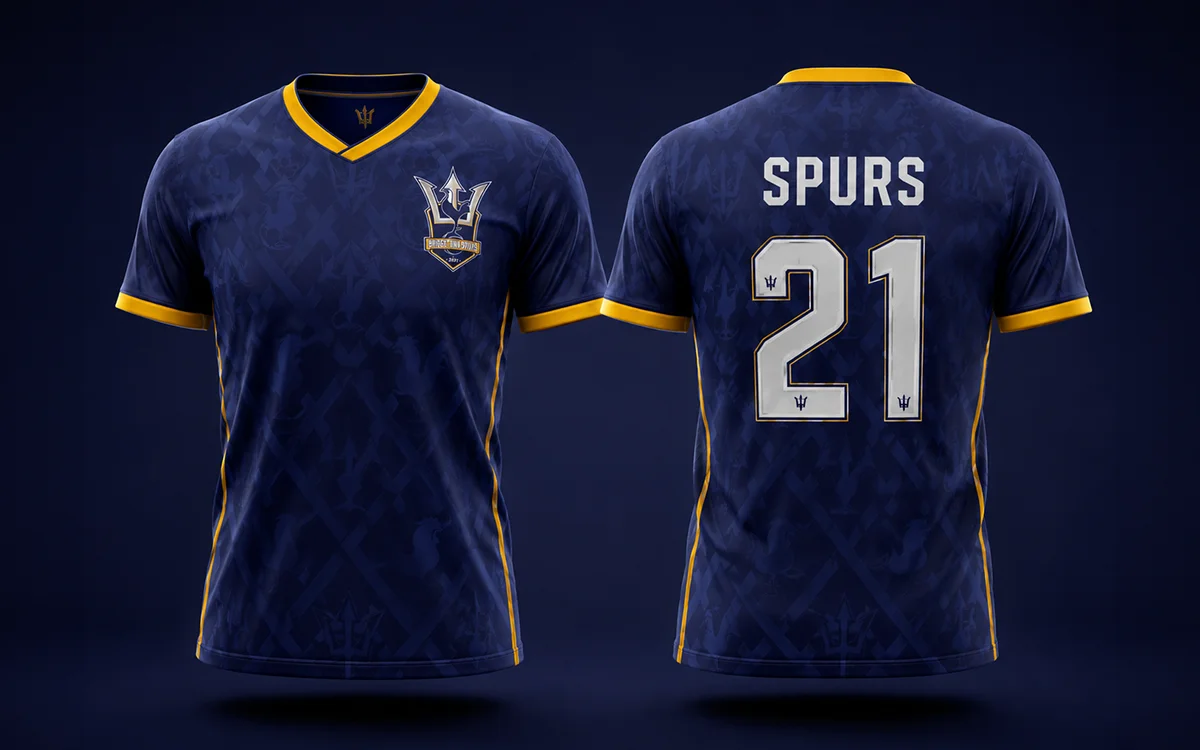
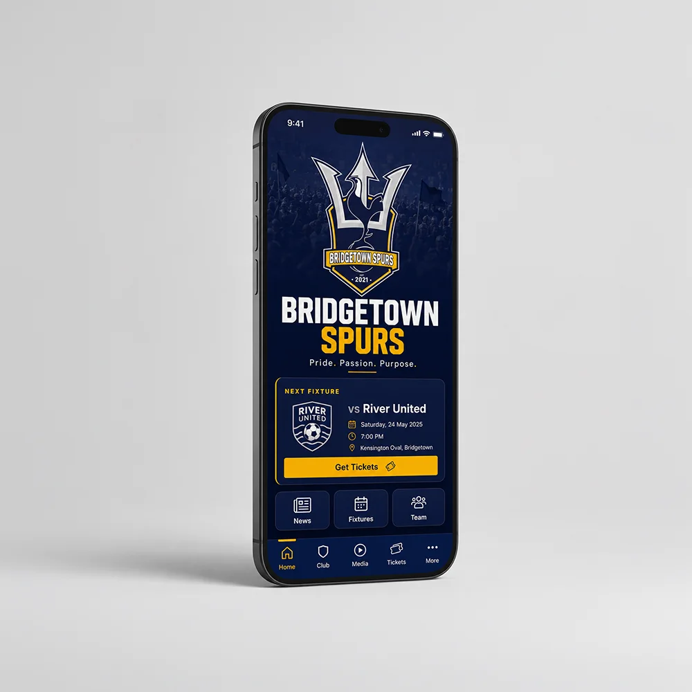
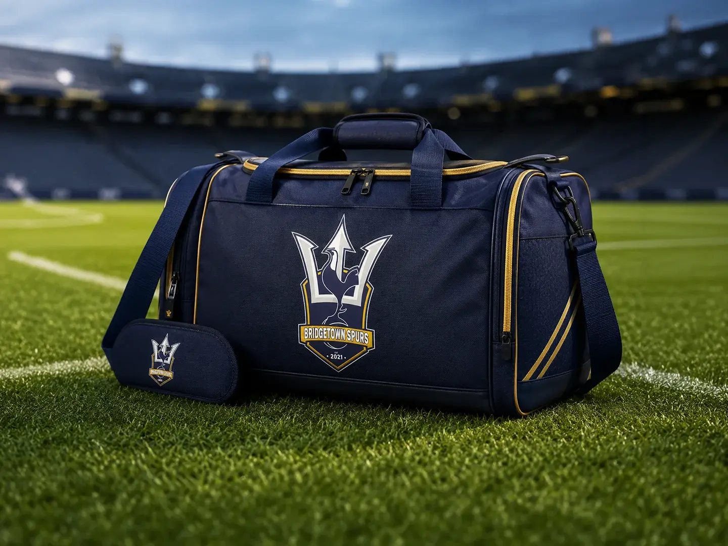
- • Stationery and application mockups




Let's create
something great.
Like what you see? Reach out to discuss how we can build a strong visual identity for your brand.
Start a Project