Rob's Fishcakes
Project Overview
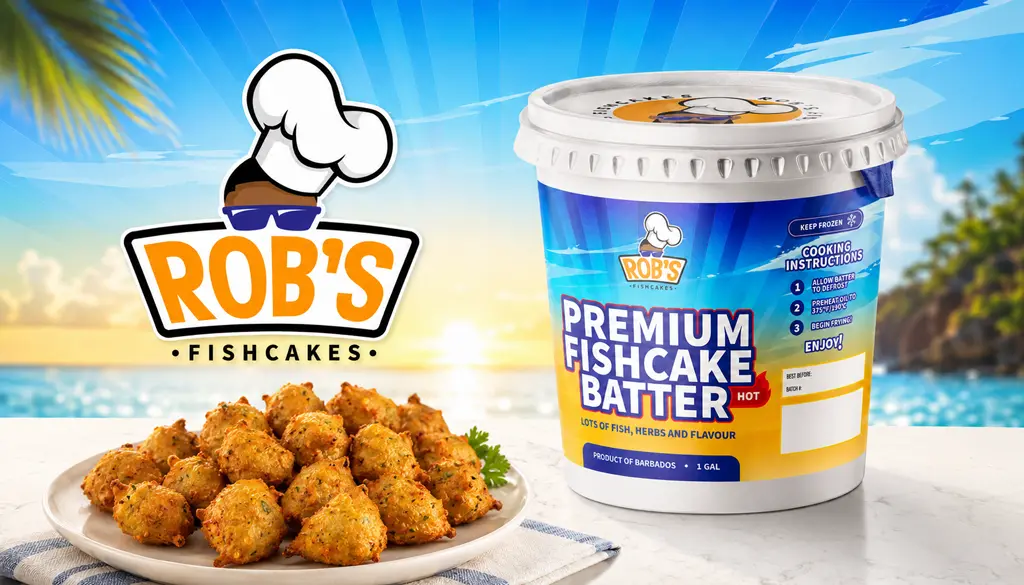
A complete brand identity refresh and packaging redesign for a Bajan fishcake batter company, elevating their visual presence from a homemade aesthetic to a premium, retail-ready product.
The Problem
The original logo and label design felt cluttered and dated. The packaging lacked visual hierarchy, making critical information like cooking instructions and nutrition facts difficult to read. Furthermore, the overall aesthetic didn't communicate the 'premium' quality of the batter or help the product stand out on crowded freezer shelves.
Design Approach
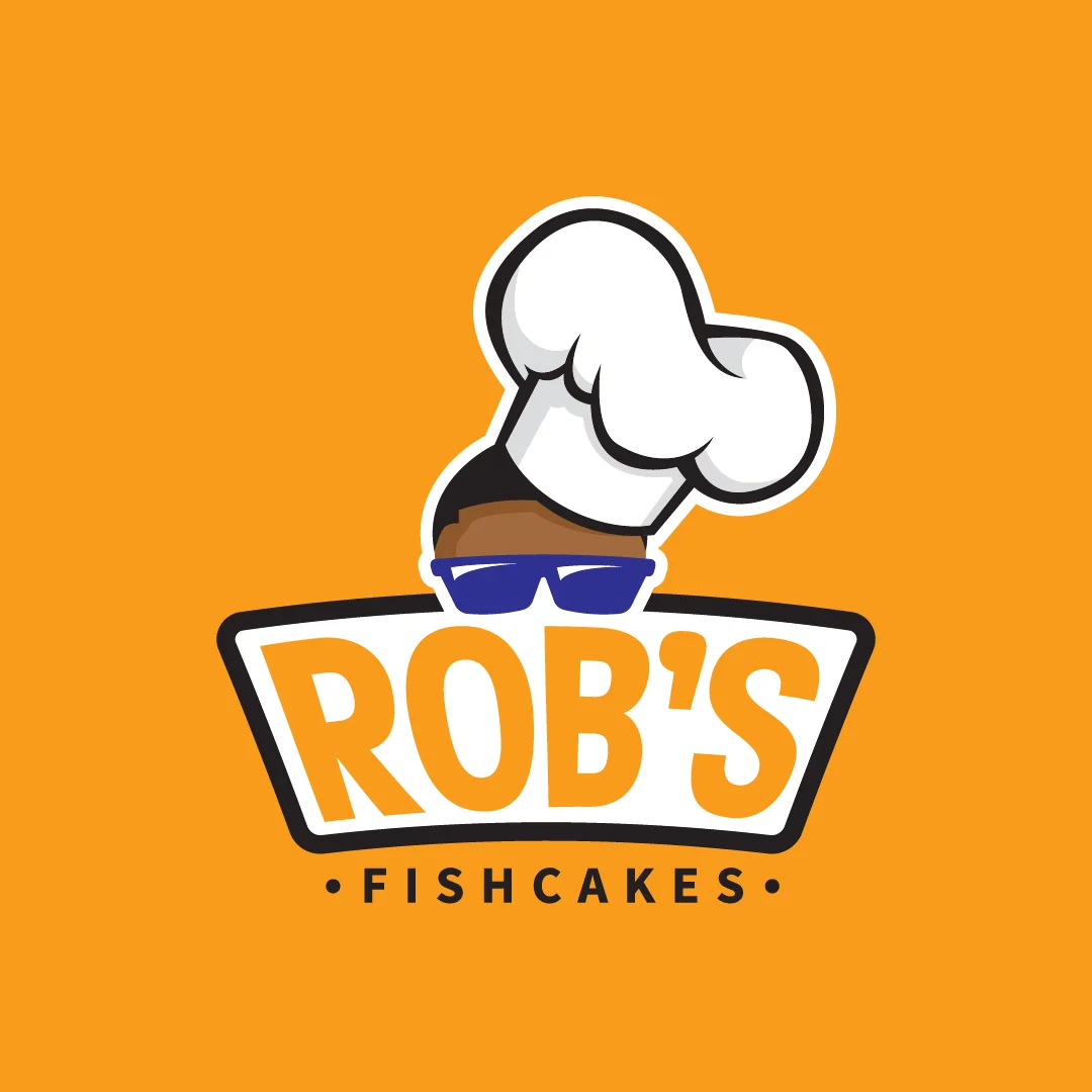
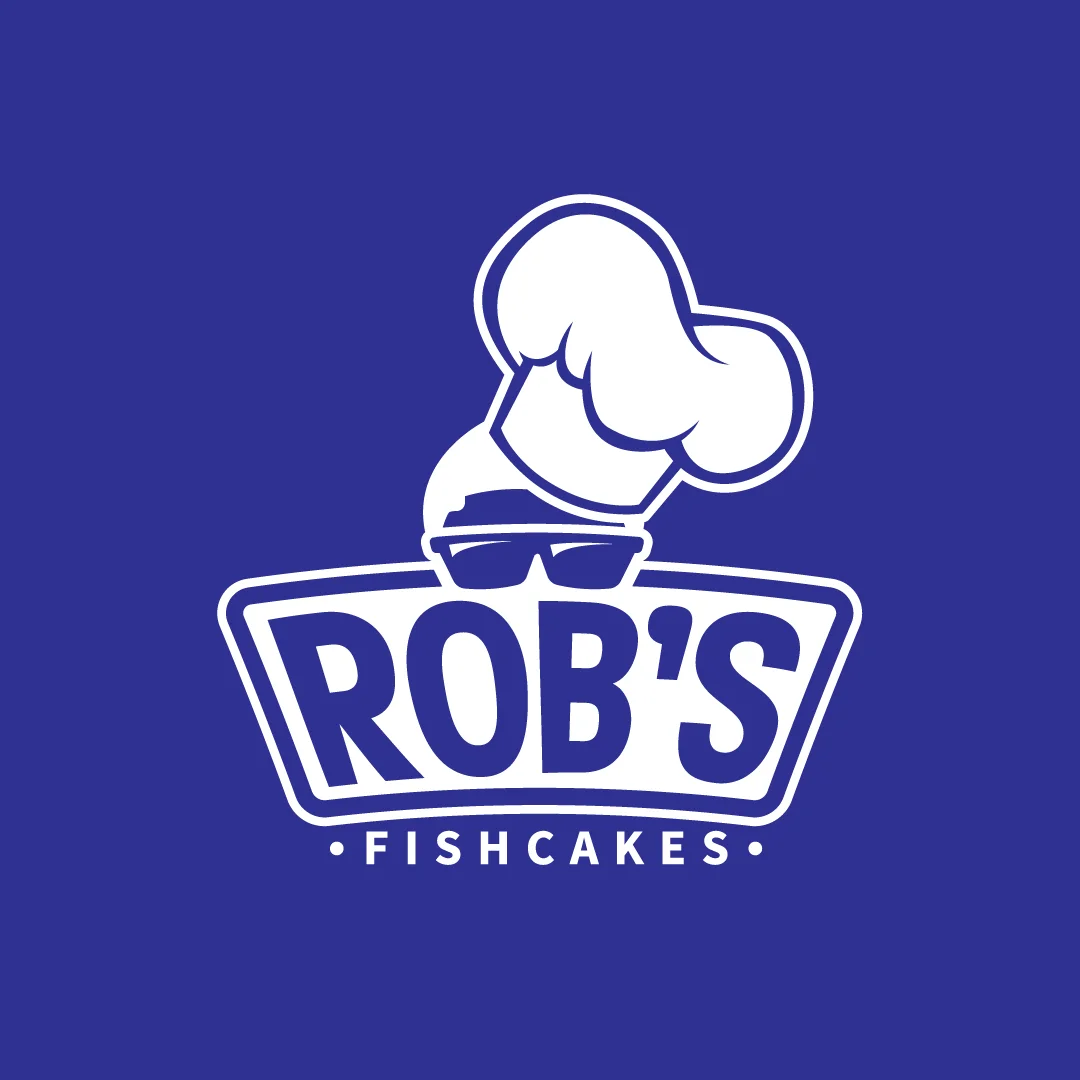
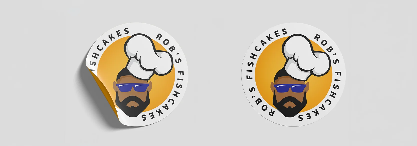
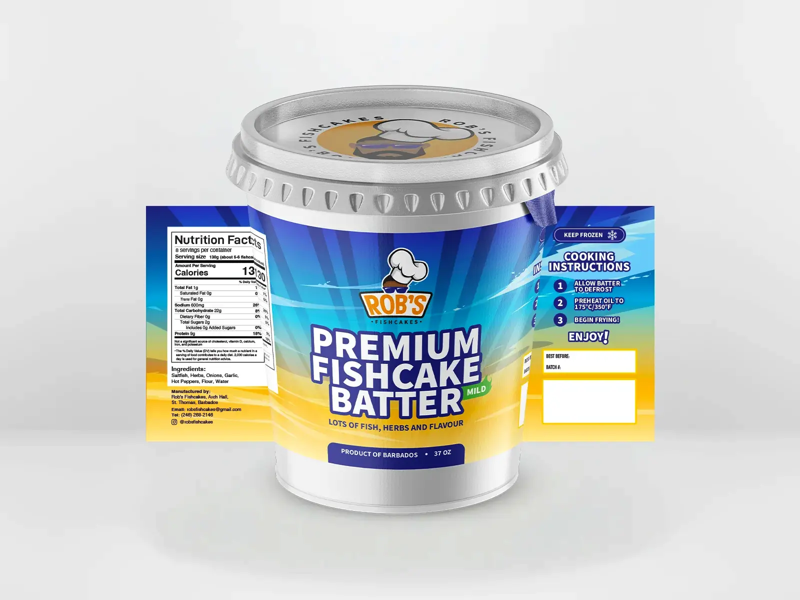
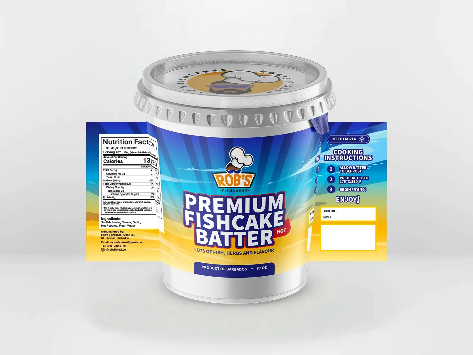
I modernized the brand by redesigning the character mascot, stripping away unnecessary illustrative details to create a bold, highly scalable, and memorable vector icon. For the typography, I introduced a friendly but structured font to reflect the approachable nature of the brand. The 37oz packaging was completely overhauled to establish a clear visual hierarchy, differentiate flavor profiles (Hot vs. Mild), and cleanly organize standard retail compliance information like nutrition facts and the 3-step cooking process.
Deliverables
- • Brand Identity & Mascot Redesign
- • Logo Stamp Variant
- • Retail Packaging Design (37oz Hot & Mild)
- • Print-Ready Production Files

Let's create
something great.
Like what you see? Reach out to discuss how we can build a strong visual identity for your brand.
Start a Project